构建企业级组件库的完整架构指南
现代前端开发中,组件库是提升开发效率和保证代码质量的核心基础设施。本文将深入剖析如何从零到一构建一个可维护、可扩展的企业级组件库架构。
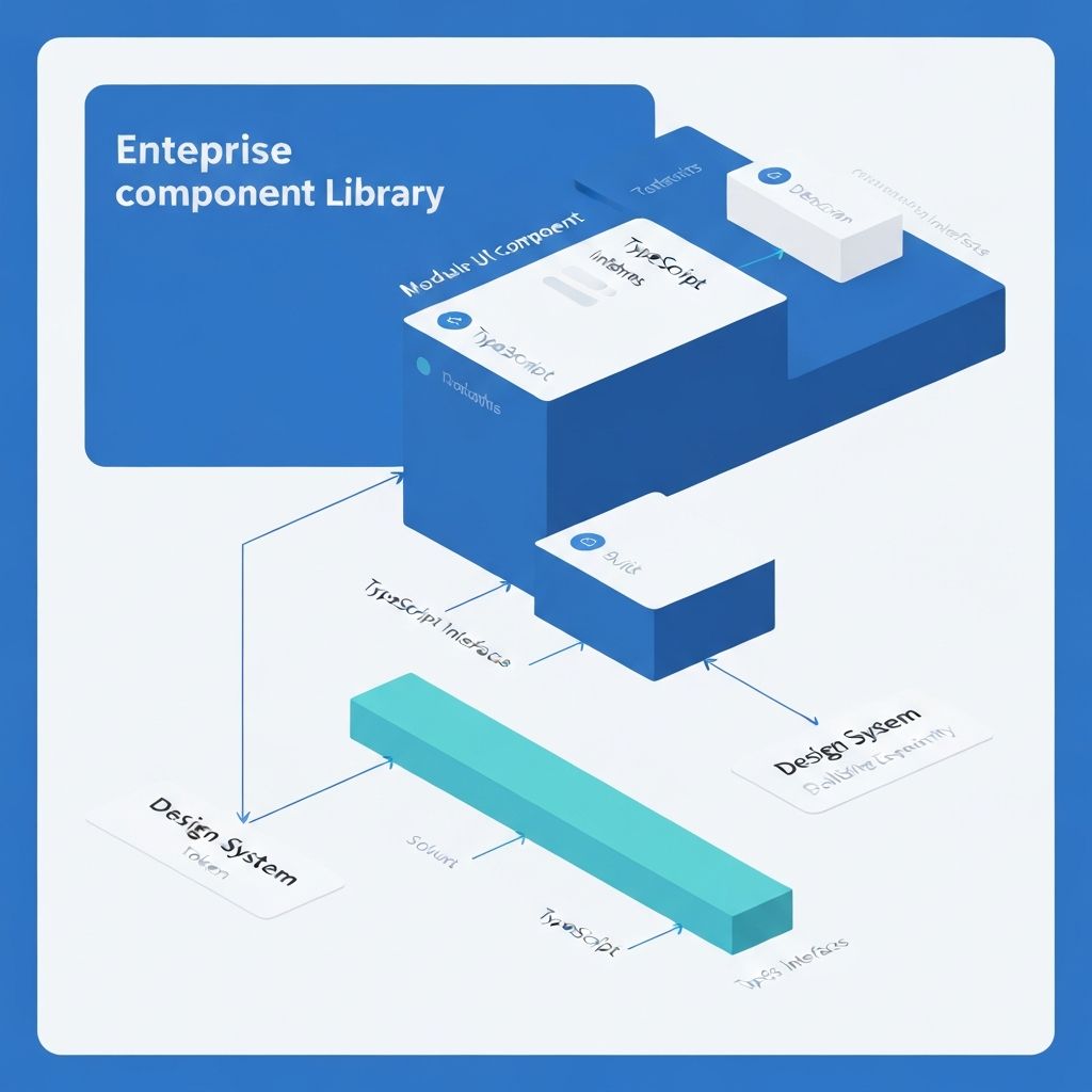
组件库架构的核心理念
一个优秀的组件库不仅仅是组件的集合,它应该是一个完整的设计系统实现,包含设计规范、组件实现、工程化工具和文档体系。
typescript// 组件库架构的核心层次 interface ComponentLibraryArchitecture { // 设计系统层:设计规范和设计令牌 designSystem: { tokens: DesignTokens principles: DesignPrinciples patterns: DesignPatterns } // 组件层:可复用的 UI 组件 components: { primitives: PrimitiveComponents // 基础组件 composed: ComposedComponents // 复合组件 patterns: PatternComponents // 业务模式组件 } // 工程层:构建、测试、发布 engineering: { build: BuildSystem test: TestFramework docs: DocumentationSystem ci: ContinuousIntegration } // 分发层:多端适配和版本管理 distribution: { packages: PackageStrategy versioning: VersionControl migration: MigrationGuides } }
目录结构设计
清晰的目录结构是组件库可维护性的基础:
component-library/
├── packages/                    # Monorepo 包管理
│   ├── core/                   # 核心组件包
│   │   ├── src/
│   │   │   ├── button/
│   │   │   │   ├── Button.tsx
│   │   │   │   ├── Button.test.tsx
│   │   │   │   ├── Button.stories.tsx
│   │   │   │   ├── index.ts
│   │   │   │   └── styles.ts
│   │   │   ├── input/
│   │   │   └── index.ts        # 统一导出
│   │   ├── package.json
│   │   └── tsconfig.json
│   │
│   ├── hooks/                  # 通用 Hooks
│   │   ├── src/
│   │   │   ├── use-media-query/
│   │   │   ├── use-toggle/
│   │   │   └── index.ts
│   │   └── package.json
│   │
│   ├── tokens/                 # 设计令牌
│   │   ├── src/
│   │   │   ├── colors.ts
│   │   │   ├── typography.ts
│   │   │   ├── spacing.ts
│   │   │   └── index.ts
│   │   └── package.json
│   │
│   └── utils/                  # 工具函数
│       ├── src/
│       │   ├── cn.ts
│       │   ├── format.ts
│       │   └── index.ts
│       └── package.json
│
├── docs/                       # 文档站点
│   ├── components/
│   ├── guides/
│   └── examples/
│
├── playground/                 # 开发调试环境
│   └── src/
│
├── scripts/                    # 构建脚本
│   ├── build.ts
│   ├── release.ts
│   └── generate-component.ts
│
├── .changeset/                 # 版本管理
├── turbo.json                  # Turborepo 配置
├── package.json
└── tsconfig.json
设计令牌系统
设计令牌是连接设计和开发的桥梁,提供一致的设计语言:
typescript// packages/tokens/src/colors.ts export const colors = { // 语义化颜色 semantic: { primary: { 50: '#eff6ff', 100: '#dbeafe', 500: '#3b82f6', 600: '#2563eb', 900: '#1e3a8a', }, success: { 500: '#22c55e', 600: '#16a34a', }, danger: { 500: '#ef4444', 600: '#dc2626', }, }, // 中性色 neutral: { 0: '#ffffff', 50: '#f9fafb', 100: '#f3f4f6', 500: '#6b7280', 900: '#111827', 1000: '#000000', }, } as const // packages/tokens/src/typography.ts export const typography = { fontFamily: { sans: ['Inter', 'system-ui', 'sans-serif'], mono: ['Fira Code', 'monospace'], }, fontSize: { xs: ['0.75rem', { lineHeight: '1rem' }], sm: ['0.875rem', { lineHeight: '1.25rem' }], base: ['1rem', { lineHeight: '1.5rem' }], lg: ['1.125rem', { lineHeight: '1.75rem' }], xl: ['1.25rem', { lineHeight: '1.75rem' }], '2xl': ['1.5rem', { lineHeight: '2rem' }], }, fontWeight: { normal: '400', medium: '500', semibold: '600', bold: '700', }, } as const // packages/tokens/src/spacing.ts export const spacing = { 0: '0', 1: '0.25rem', // 4px 2: '0.5rem', // 8px 3: '0.75rem', // 12px 4: '1rem', // 16px 6: '1.5rem', // 24px 8: '2rem', // 32px 12: '3rem', // 48px 16: '4rem', // 64px } as const
组件设计原则
1. 复合组件模式(Compound Components)
复合组件模式通过多个组件协同工作,提供灵活的 API:
typescript// packages/core/src/select/Select.tsx import { createContext, useContext } from 'react' interface SelectContextValue { value: string onChange: (value: string) => void open: boolean setOpen: (open: boolean) => void } const SelectContext = createContext<SelectContextValue | null>(null) function useSelectContext() { const context = useContext(SelectContext) if (!context) { throw new Error('Select compound components must be used within Select') } return context } export function Select({ value, onChange, children }: SelectProps) { const [open, setOpen] = useState(false) return ( <SelectContext.Provider value={{ value, onChange, open, setOpen }}> <div className="relative"> {children} </div> </SelectContext.Provider> ) } export function SelectTrigger({ children }: SelectTriggerProps) { const { open, setOpen } = useSelectContext() return ( <button onClick={() => setOpen(!open)}> {children} </button> ) } export function SelectContent({ children }: SelectContentProps) { const { open } = useSelectContext() if (!open) return null return ( <div className="absolute top-full"> {children} </div> ) } export function SelectItem({ value, children }: SelectItemProps) { const { value: selectedValue, onChange, setOpen } = useSelectContext() return ( <div onClick={() => { onChange(value) setOpen(false) }} data-selected={selectedValue === value} > {children} </div> ) } // 使用示例 function App() { return ( <Select value={value} onChange={setValue}> <SelectTrigger> <SelectValue placeholder="选择一项" /> </SelectTrigger> <SelectContent> <SelectItem value="apple">苹果</SelectItem> <SelectItem value="banana">香蕉</SelectItem> </SelectContent> </Select> ) }
2. Headless 组件模式
分离逻辑和视图,提供最大的定制灵活性:
typescript// packages/hooks/src/use-toggle/index.ts export function useToggle(initialValue = false) { const [value, setValue] = useState(initialValue) const toggle = useCallback(() => setValue(v => !v), []) const setTrue = useCallback(() => setValue(true), []) const setFalse = useCallback(() => setValue(false), []) return { value, toggle, setTrue, setFalse, setValue, } } // packages/hooks/src/use-disclosure/index.ts export function useDisclosure(initialOpen = false) { const { value: isOpen, setTrue: onOpen, setFalse: onClose, toggle } = useToggle(initialOpen) return { isOpen, onOpen, onClose, onToggle: toggle, } } // 基于 Headless Hook 构建组件 function Dialog({ children }: DialogProps) { const disclosure = useDisclosure() return ( <> <button onClick={disclosure.onOpen}>打开对话框</button> {disclosure.isOpen && ( <div> {children} <button onClick={disclosure.onClose}>关闭</button> </div> )} </> ) }
3. 受控与非受控组件
同时支持受控和非受控两种模式:
typescript// packages/core/src/input/Input.tsx interface InputProps { // 受控模式 value?: string onChange?: (value: string) => void // 非受控模式 defaultValue?: string // 其他属性 placeholder?: string disabled?: boolean } export function Input({ value: controlledValue, onChange, defaultValue, ...props }: InputProps) { // 使用自定义 Hook 统一处理受控和非受控 const [value, setValue] = useControllableState({ value: controlledValue, defaultValue, onChange, }) return ( <input value={value} onChange={(e) => setValue(e.target.value)} {...props} /> ) } // packages/hooks/src/use-controllable-state/index.ts export function useControllableState<T>({ value: controlledValue, defaultValue, onChange, }: UseControllableStateProps<T>) { const [uncontrolledValue, setUncontrolledValue] = useState(defaultValue) const isControlled = controlledValue !== undefined const value = isControlled ? controlledValue : uncontrolledValue const setValue = useCallback((nextValue: T) => { if (!isControlled) { setUncontrolledValue(nextValue) } onChange?.(nextValue) }, [isControlled, onChange]) return [value, setValue] as const }
样式解决方案
CSS-in-JS + 设计令牌
typescript// packages/core/src/button/styles.ts import { cva, type VariantProps } from 'class-variance-authority' export const buttonVariants = cva( // 基础样式 'inline-flex items-center justify-center rounded-md font-medium transition-colors focus-visible:outline-none focus-visible:ring-2 disabled:pointer-events-none disabled:opacity-50', { variants: { variant: { default: 'bg-primary text-primary-foreground hover:bg-primary/90', destructive: 'bg-destructive text-destructive-foreground hover:bg-destructive/90', outline: 'border border-input bg-background hover:bg-accent hover:text-accent-foreground', ghost: 'hover:bg-accent hover:text-accent-foreground', link: 'text-primary underline-offset-4 hover:underline', }, size: { default: 'h-10 px-4 py-2', sm: 'h-9 rounded-md px-3', lg: 'h-11 rounded-md px-8', icon: 'h-10 w-10', }, }, defaultVariants: { variant: 'default', size: 'default', }, } ) export type ButtonVariants = VariantProps<typeof buttonVariants> // packages/core/src/button/Button.tsx import { buttonVariants, type ButtonVariants } from './styles' import { cn } from '@your-lib/utils' interface ButtonProps extends ButtonVariants { children: React.ReactNode className?: string } export function Button({ variant, size, className, children, ...props }: ButtonProps) { return ( <button className={cn(buttonVariants({ variant, size }), className)} {...props} > {children} </button> ) }
类型系统设计
完善的类型定义提升开发体验:
typescript// packages/core/src/types/common.ts import type { ReactNode, ComponentPropsWithoutRef } from 'react' // 多态组件类型 export type PolymorphicComponentProps<E extends React.ElementType> = { as?: E children?: ReactNode } & Omit<ComponentPropsWithoutRef<E>, 'as' | 'children'> // 使用示例 export function Box<E extends React.ElementType = 'div'>({ as, children, ...props }: PolymorphicComponentProps<E>) { const Component = as || 'div' return <Component {...props}>{children}</Component> } // 完全类型安全的使用 <Box as="button" onClick={() => {}} /> // ✅ 正确 <Box as="div" onClick={() => {}} /> // ✅ 正确 <Box as="a" href="/" /> // ✅ 正确 <Box as="button" href="/" /> // ❌ 类型错误 // 尺寸类型定义 export type Size = 'xs' | 'sm' | 'md' | 'lg' | 'xl' // 变体类型定义 export type Variant = 'default' | 'primary' | 'secondary' | 'outline' | 'ghost' // 颜色方案类型 export type ColorScheme = 'primary' | 'success' | 'warning' | 'danger' | 'neutral'
测试策略
完整的测试体系保证组件质量:
typescript// packages/core/src/button/Button.test.tsx import { render, screen } from '@testing-library/react' import userEvent from '@testing-library/user-event' import { Button } from './Button' describe('Button', () => { // 快照测试 it('should match snapshot', () => { const { container } = render(<Button>Click me</Button>) expect(container).toMatchSnapshot() }) // 行为测试 it('should handle click events', async () => { const handleClick = vi.fn() render(<Button onClick={handleClick}>Click me</Button>) await userEvent.click(screen.getByRole('button')) expect(handleClick).toHaveBeenCalledTimes(1) }) // 可访问性测试 it('should be accessible', () => { render(<Button>Click me</Button>) const button = screen.getByRole('button', { name: /click me/i }) expect(button).toBeInTheDocument() }) // 变体测试 it.each(['default', 'destructive', 'outline', 'ghost'] as const)( 'should render %s variant correctly', (variant) => { render(<Button variant={variant}>Button</Button>) expect(screen.getByRole('button')).toHaveClass(variant) } ) // 禁用状态测试 it('should not trigger click when disabled', async () => { const handleClick = vi.fn() render(<Button disabled onClick={handleClick}>Click me</Button>) await userEvent.click(screen.getByRole('button')) expect(handleClick).not.toHaveBeenCalled() }) }) // packages/core/src/button/Button.a11y.test.tsx import { axe, toHaveNoViolations } from 'jest-axe' import { render } from '@testing-library/react' import { Button } from './Button' expect.extend(toHaveNoViolations) describe('Button Accessibility', () => { it('should not have any accessibility violations', async () => { const { container } = render(<Button>Accessible Button</Button>) const results = await axe(container) expect(results).toHaveNoViolations() }) })
文档系统
基于 Storybook 构建交互式文档:
typescript// packages/core/src/button/Button.stories.tsx import type { Meta, StoryObj } from '@storybook/react' import { Button } from './Button' const meta = { title: 'Components/Button', component: Button, parameters: { layout: 'centered', docs: { description: { component: '按钮组件用于触发操作和事件处理。', }, }, }, tags: ['autodocs'], argTypes: { variant: { control: 'select', options: ['default', 'destructive', 'outline', 'ghost', 'link'], description: '按钮的视觉样式变体', }, size: { control: 'select', options: ['default', 'sm', 'lg', 'icon'], description: '按钮的尺寸', }, disabled: { control: 'boolean', description: '是否禁用按钮', }, }, } satisfies Meta<typeof Button> export default meta type Story = StoryObj<typeof meta> // 默认故事 export const Default: Story = { args: { children: '默认按钮', }, } // 变体展示 export const Variants: Story = { render: () => ( <div className="flex gap-4"> <Button variant="default">默认</Button> <Button variant="destructive">危险</Button> <Button variant="outline">轮廓</Button> <Button variant="ghost">幽灵</Button> <Button variant="link">链接</Button> </div> ), } // 尺寸展示 export const Sizes: Story = { render: () => ( <div className="flex items-center gap-4"> <Button size="sm">小按钮</Button> <Button size="default">默认按钮</Button> <Button size="lg">大按钮</Button> </div> ), } // 交互示例 export const WithLoading: Story = { render: () => { const [loading, setLoading] = useState(false) return ( <Button onClick={() => { setLoading(true) setTimeout(() => setLoading(false), 2000) }} disabled={loading} > {loading ? '加载中...' : '点击加载'} </Button> ) }, }
构建与发布
Monorepo 管理
json// turbo.json { "$schema": "https://turbo.build/schema.json", "pipeline": { "build": { "dependsOn": ["^build"], "outputs": ["dist/**"] }, "test": { "dependsOn": ["build"], "cache": false }, "lint": { "outputs": [] }, "dev": { "cache": false, "persistent": true } } }
版本管理
使用 Changesets 管理版本和发布:
markdown<!-- .changeset/cool-feature.md --> --- "@your-lib/core": minor "@your-lib/hooks": patch --- 新增 Button 组件的 loading 状态支持 修复 useToggle Hook 的类型定义问题
json// package.json { "scripts": { "changeset": "changeset", "version": "changeset version", "release": "turbo run build && changeset publish" } }
总结
"构建企业级组件库需要在设计系统、组件设计、工程化和文档体系等多个维度进行系统性思考。通过合理的架构设计、完善的类型系统、全面的测试覆盖和清晰的文档,可以打造出既好用又易维护的组件库。
一个优秀的组件库不仅能提升团队开发效率,更能成为企业设计语言的载体,确保产品体验的一致性。从设计令牌到复合组件,从类型安全到自动化测试,每个环节都值得精心打磨。记住,组件库的价值不在于组件的数量,而在于其可维护性、可扩展性和开发者体验。